Thursday, June 15, 2017

PSA Responses

The following is my analysis of two PSAs from the perspective of a school administrator.

The first PSA I analyzed is:Telenor The Essay Commercial
Main Idea: The main idea seemed to be that this new 3G Telenor phone is so innovative that it’s almost futuristic; the phone has features that could only be dreamed up in a fictional story. 

Audience: It’s difficult to identify a specific audience. At first, it seems like the audience may be  the skeptics of technology advancement in order to show that achieving the seemingly unachievable is in fact possible. However, I believe another intended audience would be individuals who yearn to have the newest, most innovative pieces of technology. The ambiguity in audience is addressed below in regards to the effectiveness of the video.

Effectiveness: Overall, the methods used to create this video were not effective. First, the heavy accent of the young girl made some of her words difficult to understand. As a result, parts of the message were lost. Also, I think the message was taken a bit too far. It seemed that everyone thought the young girl was medically insane. No consumer would want to connect to such a person, and I also do not believe it’s fair to judge her ideas as insane. The commercial would be more effective if it focused more on everyday people questioning her story and less on medical personnel listening grimly to her ideas; that way, the message would be more along the lines of “unique thoughts lead to innovation” instead of “our product was designed by mentally unstable individuals.” As an administrator in a school, I would want to promote acceptance of unique and individual ideas without labeling people as having medical conditions. I think that with some editing, this PSA could be drastically improved.


The second PSA I analyzed is We Think

Main Idea: The main idea is that “the 21st century equals mass innovation” and sharing more ideas on the internet will lead to an overall better society.

Audience: The audience is individuals who have access to Web 2.0 tools, specifically younger generations who are susceptible to accepting new ways of thought.

Effectiveness: The overall methods used to create this video were effective. I believe this would send a useful message to the students in my school on two levels. First, the content promotes the importance of sharing ideas through the web, which is something that my district emphasizes strongly. The simple drawings and handwritten text also sends the message that ideas can easily be shared through videos made by individuals such as this one. It helps students see that sharing ideas digitally does not require a large budget with hired actors and professional scripts. I believe this video could inspire the students in my district. The only changes I would make would be to make some of the handwriting neater and easier to read and to try to shorten the message to keep viewers engaged throughout.


References
[CharlesLeadbeater]. (2008, February 26). We think. [Video]. Retrieved from https://m.youtube.com/watch?v=qiP79vYsfbo

[WirelessFederation]. (2013, February 12). Telenor the essay commercial. [Video]. Retrieved from https://m.youtube.com/watch?v=z-uOO6O9uus

Sunday, June 11, 2017

Infographic Reflection


 Infographics can be extremely useful classroom tools and help differentiate assessments by appealing to multiple intelligences. Web 2.0 tools such as Canva, Google Photos and Drawings, and FotoFlexer enable students to create original infographics digitally. By creating timelines or statistical representations, students can analyze course material and demonstrate mastery.

One way to use infographics in the classroom is to have students create timelines through tools like Google Photos or Canva. I outlined several ways timelines may be used to connect pieces of literature to the real world in my Adobe Spark Unit 6 Timeline Infographics Post. Additionally, students may create timelines to outline events in the plot of a story. Having students create timelines is an effective way to assess both their comprehension of the story and their ability to locate the main idea of the story. Students can find applicable Creative-Commons licensed images that relate to each event and combine the plot events and images into a visually-appealing infographic. This activity would appeal to the visual-spatial learners and may be a more effective assessment than a traditional exam.

Another way infographics may be used in the classroom is to create statistical infographics through tools like Google Drawing or FotoFlexer.. Even though I teach English, statistics can be applied to my classroom. For example, in my Animal Farm Unit, I have students discuss which animal was ultimately to blame for the downfall of the farm. After the discussion, students could compile the opinions of their classmates into a statistical infographic and then write a reflection explaining whether they agree with the consensus. Additionally, students could create a statistical infographic indicating which novel was everyone’s favorite for the year. As an end-of-the-year reflection, I always have students complete a questionnaire explaining which novel they liked the best and least throughout the year. This activity could be taken one step further by having students create an infographic that displays the results. In addition to reaching the visual-spatial learners, each of these activities also appeal to mathematical-logical learners.

Since I teach high school students, creating the above infographics would be appropriate to their age and grade level. Although my students do not have daily access to Web 2.0 devices, these activities could easily be completed in 1-2 class periods by reserving the library or signing out a chromebook cart. Creating infographics is an engaging way for students of multiple intelligences to demonstrate learning.

Wednesday, May 31, 2017

Digital Presentation Reflection


Digital presentations enable both teachers and students to easily relay information to large groups of people without necessarily having to physically present the material in front of the class. They also work particularly well as review activities.This week I created an interactive Padlet Presentation on imagery and an Adobe Spark Video tutorial on identifying and explaining the five elements of plot. Tools such as these allow teachers to turn boring, everyday lessons into engaging multimedia productions.
Both presentations were very simple to create, and I’m happy with the outcomes. I made each presentation into a sort of review activity for my students. The imagery padlet allows students to review the definition of imagery, look at a sample imagery description, and then write imagery descriptions of their own for various images. The Adobe Spark video on plot reviews each element of plot and provides examples from Cinderella of each of the elements. This video serves as a model of how to break a story into the five different plot elements. The only complaint I have about each tool is that the selections for font styles, colors, and sizes is limited with each program. Users can choose from a variety of layouts and themes, but it is not possible to change specific fonts within those themes to make them more easy to read. It would be nice to add more contrast and bold or color font for emphasis.
I would like to use each of these presentation tools with my students. Padlet can serve countless purposes in the classroom but works particularly well as a review tool. It’s a good alternative to a pencil and paper review worksheet. However, I probably will not use it often in the classroom since I do not have easy access to computers in my classroom on a daily basis. Padlet is a available as a phone application, but it can be a bit tedious to use on such as small screen, so it’s not ideal. I could justify reserving a chromebook cart for an occasional padlet activity, but I will not be able to have students use it regularly. However, there are two alternate ways I can use Padlet more often. One is for me to simply project that Padlet presentation in front of the class and have students discuss responses rather than posting responses on the actual padlet. Another option would be to assign a review activity for homework and have students access it at home.
I see myself using the Adobe Spark Video more in my classroom. For the short story unit, I usually have my students create a plot diagram on paper for one of the stories we read. Students could easily use Adobe Spark Video to create a digital version. This version would be a more engaging alternative to a paper diagram. I would need to reserve a Chromebook cart for my room, but with some advance notice that wouldn’t be an issue. Creating a Spark Video plot diagram would require about the same amount of class time and would meet the same requirements of the assessment for that unit. Additionally, I will also use Spark Video to create tutorials on how to use other piece of technology, such as VoiceThread. I can take screenshots of different steps of creating a VoiceThread and use audio to narrate specifics instructions. This will help students learn how to use new technology.
These tools can easily be implemented into most classrooms. Teachers can create review activities for students to interact with, or students can create their own presentations which serve as assessments for a unit. Either way, digital presentation tools such as Padlet and Adobe Spark Video can  help bring an ordinary lesson to life.

Sunday, May 14, 2017

Using Google Slides to Monitor Student Contributions to Group Projects

Group projects. The sound of those two words makes many students cringe. They know that there is always inevitably the group member who takes control and wants to do everything on her own, the student who is habitually absent and reluctant to work, and then those caught in the middle to mindlessly complete the task. While there is no one, guaranteed way to make fix these issues with group projects, I have found that technology can help ease some of the frustrations for both students and teachers  associated with group projects.

Even as a teacher, I used to hate assigning group projects. I dreaded it as much, if not more, than the students. I know that collaboration is an essential skill that students need to learn in order to succeed in the real world, but I also dreaded the chaos that always ensued by implementing projects in the classroom. I would always assign both individual and group grades to try to help with the problem of some students doing all of the work and others doing none of the work, but still, this did not solve the problem. I would have students rate the contribution of group members and provide specific feedback. However many students feel uncomfortable speaking badly about a classmates' work, so they would often provide positive ratings even when a student did not do adequate work. At the end of the project, the students who worked diligently resented both the slacker students in their group and me, the teacher who forced them to complete the project.

However, by experimenting bit with Google Slides, I found that this did not have to be the case with group projects.  Teachers can use Google Slides to monitor the changes to the presentation made by each student. The first step of the process is for one student in the group to create a new Google Slides presentation and share it will all of the group members and the teacher.  It is important to make sure the student chooses "can edit" when sharing the presentation. Now, each group member can work on the project at the same time and changes will show up and be saved automatically. Changes can also be made from anywhere internet connection is available, which means even students who are absent can work on the project from home (if internet is available at home).

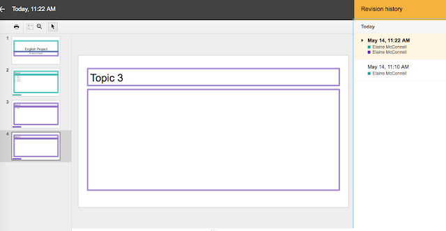
Even more importantly, as long as the presentation is shared as "can edit" the teacher can now track specific changes made by each student.  By clicking the icon in the menu screen that says "All changes saved in Drive" a teacher can see a breakdown of all of the changes made by each student. Now, there is no longer any question as to the amount of contributions each student made to the project. I added two screenshots of a sample presentation to show you how this process works.


Once a presentation is shared with you, you can click "All changes saved in Drive" in the top menu, and it will open the Revision History shown in the image below.

Once the revision history box is open, it color codes all of the changes made by the different students. You can click on the changes on the right to see more specifically what changes were made. I used two different accounts that were both under my own name, which is why both the purple and teal colors show up as "Elaine McConnell." Your students' names will each show up under the revision history as their own names and each will receive a different color.

This tracking also provides a good way to monitor progress before a project is complete. Students are often skilled at looking like they are busily working and yet not actually doing anything productive. During the class period, I open each project to see who is actively contributing and who simply has the document open and is not actually working. This helps me intervene early if I see that one person seems to be making all of the contributions. When grading the project, I can clearly tell who deserves full credit for the assignment. An added bonus is that a teacher can tell if changes were made to the document after a deadline and take that into consideration when grading.

Is this sure-fix to the problem? Absolutely not. Once, I caught a student logged in as her boyfriend to complete part of the project under his name so that he received credit. However, this seems to be more of an exception than a norm. When introducing a group project, I show students how I am able to view their contributions so that they are aware of how I will grade their work. Since implementing this group work policy in my classroom, I have seen that students put more effort into group projects since they can be held more accountable on their individual contributions. Using this tracking feature on Google Slides has changed the way group projects work in my classroom.

I would love to hear feedback about whether or not this process is successful in your own classroom or other ideas on how to make group work more efficient in the classroom.

PSA Responses

The following is my analysis of two PSAs from the perspective of a school administrator. The first PSA I analyzed is: Telenor The Essay C...